Join me....

I believe that art enriches and informs our lives everyday in many positive ways. Sharing those experiences, whether as an artist or as an appreciator, is part of the pleasure. I welcome your comments and hope you find something of value: a laugh, an insight, a new idea or just a happy moment. Enjoy art!
Showing posts with label experiments. Show all posts

Friday, November 16, 2018

Science, Art or Magic?

There is a great attempt to explain the similarities
and differences between art and science in this 2016
But couldn't we just accept as fact 
that certain things are best explained by
 MAGIC?

Last fall I played with eco-dying and enjoyed making prints on paper from the leaves I collected on my hikes.  I turned these sheets into covers for notecards and happily sold every one that I made.  But there was a fair amount of "slippage," those attempts that failed, misprinted, didn't make color or for some reasons became a page that fell short of artistic use.

So this year I decided to dive deep into scientific research conducting various experiments and recording my findings.  So out of my nature! But let's eliminate the misprints, ok?


I set up 3 different mordants (the liquid soak that prepares the fibers to accept the color) labeling them and giving each test paper the same amount of soak time.


I divided my leaves by types and included a few I'd never tried. (Not all botanticals will leave a visible print with this steaming method.) Oak was always a challenge but I decided to include it in my attempts.


Three different mordants, 2 kinds of cotton paper, several leaf types (pressed previously), a steaming pot outside and I was in business, er, science lab mode.  


Wow!  Look at that oak, that geranium, that batista and those maples...on a roll: sumac, sassafras and beech.  Dump the vinegar soak, eliminate the ammonia...I was ready to rock the next day with 100% success.  Papers prepped I went to bed exhausted but smiling for the success to come.


I was rewarded, above.


I was disappointed, above.


I was confounded, above.
None of these are ghost prints, the print bleeding through the paper or the mark left by the "top" of the leaf (best prints come from "ground side down" on the paper). And not an oak to be seen.  Whaaaa?

So I made adjustments in pressure (the vise or stones or blocks that hold the bundles tightly together). I varied the timing of the "cool." I stood on one foot and I sang out loud.  Everything STILL came out in about the same ratio of great : good : blah.  

My conclusion? MAGIC.

I did not record where I found each leaf, the soil conditions it grew in, the altitude it lived in...in my heart I know that these are all contributing factors to whatever hides deep within the tannins et al that leave the mark I covet.  I'm not that into research.  And frankly I like the fact that there is a part of this that I cannot control, it makes opening the steamed bundles quite exciting.  Some phenonmena can be explained and some things are best left to magic.  

I rest my case.

MAGICALLY IN AWE,
Cindy

Friday, October 26, 2018

Changing the Mood

The connections between color and mood
have long been a subject of debate and
scientific study.  Since I love color I
enjoy these studies and am always game to do a little
experimenting on my own.


Taking the same photo reference I have used in a couple of paintings earlier I decided to see how I could convey a different feeling using composition and color.  These were not going to be large, finished studies but quick draws to see what I could make happen in a crude sort of way.


Here is the barn, alone and on the hill.  Another sketch below moves the barn:
And yet another adds a path:
So these 3 sketches changed the composition and, I thought, already altered the mood of the scene.

On smallish canvases I started with acrylic paints to get something laid in quickly.  These are photographed together but I actually painted them one at a time so as not to confuse my own sense of where they were attempting to go.


Already you can see color differentials; upper R - light, maybe springish, sunshine, below - sense of soltitude but not sad due to blue skies and some foreground energy, lower L - darker, maybe stormy and a road which by-passes the far away barn.

Obviously I did not push the color beyond realism, some folks would get a big nothing from a purple barn in an orange field (besides, I've been there...!) I wanted to see what I could do with local color (i.e. the color as seen in nature).

I did a little bit more work on these canvas in oil, making more changes as I worked.  You be the judge as to how they affect you in ascertaining a certain mood (I think of the barn having its own feelings as does the environment; you may also think about how the scene affects your own mood.)


Above I darkened up the baby blue skies...did a storm threaten?


Here I implied a season by using flower colors, sunshine and cloud shadows on the grass, is the barn still important to the composition?


In the final iteration I worked on a pathway that leads away from the barn and darkened any detail it would have if it were lighter in color.  

All of these are a long way from a finished version, they are crude and very raw, but I enjoyed the exercise of manipulating a photograph and playing artist in creating a different feeling from the same ingredients.  Since I have answered some of my own questions there is no need to complete them...I'll file under "study" and move on.

Look at the art you surround yourself with: are there variations in the moods and colors or do you tend to one direction?  There is no right or wrong answer....it's simply a thought.  What I might hang for "healing" would not be what I would choose for "action."  Just another aspect to creating a well planned piece of art.

Colorful wishes,
Cindy

Friday, September 21, 2018

Cone Flower Truth or Dare

Sometimes artists will paint from the same reference
photo over and over again.  Perhaps a few know
they have a winner for sale but others, like me,
want to see just how differently they
can render it each time.

And so it goes with these pinky-purple cone flowers...something I find very difficult to render.  I'm still deciding if the outcome of the latest was a win or a loss but I can say honestly that I took the dare not to stick totally to the truth!


This is a basic rendering of the lights and darks and I tried to make a few notes as to where my blossoms were to end up.  I think I was using up the tail end of a day's left over paint so I knew I had a long way to go from here.


A little more definition of a rock and a much better flow of color in the background.


Now this is when I am so tempted to quit: drab, drab, drab.  I like the little yellow-green leaf near the bottom right hand corner....that's all.  But "tests" should be pushed until they are beyond salvage and the optimist in me thought I could maybe, just maybe keep on.


Here is a detail of one flower...not too much to brag about but definitely an improvement from above.


Cone Flowers, 12 x 16, oil

Done.  At least done for me.  Agony in the home stretch and almost wish I had quit sooner and used my time elsewhere.  But that's not the point, is it?  

Here's a bonus note: take some time, zoom in and find some small spots you do like in this painting: a certain petal, a color contrast, a splash of texture....just look carefully and state a couple of things that you like.  There.  You have just widened your ability in appreciating art...a very useful technique at a gallery or a museum.  You don't have to like it en toto....but try to find something that intrigues you and you will begin to define your own taste.  

TAKING THE DARE,
Cindy

Friday, September 14, 2018

Step by Step...a Heron

Sometimes you know exactly what
you want a painting to look like when done;
sometimes you just go with the flow
and see what happens...

And while the subject of this painting (or the object) was to be a white and grey heron slightly off center, I was much more interested in seeing how the surrounding foliage and foreground waters were going to take shape.  Here's the step by step, over the course of several days and one vacation!


blocking out the lights & darks
establishing some texture & motion


playing with the colors
stating the direction of energies


pushing the "hole" back further 
placing the bird
establishing the patterns of reflections


Sacred Space, 16 x 12, 
oil on canvas
finished


detail of texture and color

This is a rather large "test tile" for me as I usually try to do experiments on an 8 x 10 canvas.  However I am finding that with a large, flat brush it is much easier to work on a larger size support...there is much more real estate to play with and for me that means more color gradations which is what the experiment is all about.  (Now what will I do with all those 8 x 10's I have stacked up and ready to go? hmmmmm)

SPLASHING AROUND,
Cindy
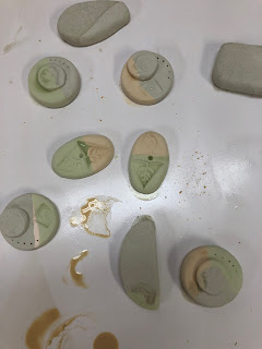
p.s.  I am making too many experiments to frame them all.  Someday I will get the best ones loaded up onto my website for purchase "as is."  Meanwhile if you find one that rings your chimes let me know; the "test tiles" are an inexpensive way to enjoy original art.  email: art@cindymichaud.com

Friday, July 20, 2018

Test Tile = Epic Fail!?

It's not really a "test" if you do the
same ole same ole over again.  Only if there is
a risk or an element of uncertainty
 is it really, truly a "test."

At least that is what I am telling myself.  After a few "tests" that went extraordinarily well I got to feeling a little too comfortable in my 9 x 12 fast paced experiments.  I could feel hesitation creeping in and I knew I was taking the "safe" road.  Here are two quickies that I did in acrylic:


Both are layouts done quickly to see if I like the composition (check).  Both are awaiting the next layer to be done in oil.  Both are incredibly GREEN.  


So I tackled this one first.  I really loved the sunlight that was cast strongly on the opposite shore and peeked through the leaves onto the foreground trees.  Above you see a bit more application of oil paint.


I worked my way into the scene and paused.  Evaluation time.  I liked the foreground; the little hints of warm colors really made the shore line move forward.  But the rest: boring.  This kind of scene is a "dime a dozen" and while nothing was really wrong with it there was nothing very interesting about it either.  Not an exciting test.  Soooooo...

Balls to the wall: coulda shoulda woulda.


Well.......
I have bad news and I have good news!  This is clearly not a great painting, but it is a great experiment.  We have two color palates going on here and they do not dance well together.  The upper left quadrant has possibilities  The lower left quadrant is still interesting.  But nothing else seems to jive with an overall look.  Test tile FAIL.  As in "don't try this again."  But...the good news is

I did not stay "safe" (i.e. "boring").  I reminded myself that careful thought about choosing a color palate BEFORE starting a piece is time well spent.  If the greens were too too (green) then I should not start with them.  The color must develop organically, from the bottom layer to the top....not a hastily added as an afterthought.   

I also reminded myself that as long as the values read well (that is, dark is dark and light is light) it really won't matter if the tree is red or green.  I just need to decide first whether I am going for excitement or realism and stick to the plan.  Test tile SUCCESS.   

This is probably far more than you wish to know about building a painting but it is all part and parcel of the time spent prepping for that masterpiece that comes together seemingly so easily.  These are the practice pieces that no one ever sees, the prototypes that never see the light of day.  I just think it is interesting to share the fact that those who make art encounter the same problems as those who make cars: not all great ideas work.  Tweak.  Re-tool.  Try, try again.  Failures are sometimes much more informative than successes.

I promise that you will see a painting from this reference photo again.  You may not recognize it.  But I will take all of the data I have gathered from this "epic fail" and hopefully render a much more pleasing (and interesting) piece in the near future.  Stay tuned.

EXPERIMENTALLY YOURS,
Cindy


Friday, April 6, 2018

Learning About Test Tiles

There are many benefits to having test tiles for glazes. It allows you to test combinations of glazes easily and inexpensively, and serves as a permanent reminder of what a glaze looked like on a certain clay. Otherwise, if you’re like me, you forget very quickly.       How to make test tiles
I am not a potter, but I have the pleasure of hanging out with quite a few of them.  Now put two or more in room and inevitably you will hear the words "test tiles" bandied about.  If you don't wish to read the link above, they are quite simply prototypes for finding out how glazes will look on a finished piece.  They are the necessary research done prior to making a huge batch of "yucks."  Time, patience and note taking are required.
I got a free and much needed lesson in testing this week thanks to one of those distinguished potters.  I had a whim to make ceramic knobs for my kitchen, each one original and special and in a color palate I could only dream of, never mind buy.  My kind neighbor Maggie Black was eager to help me and after giving me a few tips left me to my own devices.

I had a ball rolling out the clay, cutting up shapes and then stamping them with pre-selected designs.  Perfection was not an issue because frankly I did not know enough to realize what goofs might stymie me later on.

It was actually a lot like making cookies.  They needed to be more or less the same depth and size (I knew they would shrink a skoosh) and I wanted the designs to be sorta related (lots of leaves).

Maggie popped them in the kiln and summoned me to come add the color.  Turquoise and yellow I announced.  It was then she burst my eager bubble and suggested, no, insisted, that I do some "test tiles."  Dread.  Time down the drain I began to think but she was slightly more accomplished in this endeavor than I!


So I dipped and cleaned and kept my selection to about 3 or 4 different jars...my memory is short.  And tried double dips, matt and shiny and did my best to hide my disappointment that this little project would be prolonged another week. 


So you can guess my next chapter, right?  Herewith the test tiles and it is no surprise than some of them are just butt-ugly.  You can be sure I was thanking Miss Maggie profusely from preventing me from sacrificing all my previous work in one impatient move.  

I played with these results, made notes, passed them by the other kitchen resident and made some decisions on how to proceed.  A long careful painting session, a few more random experiments (but not on the preselected, designated knobs) and we were back to the cooker, um, kiln.


This is the oven where the magic happens...and where surprises come out even with the best of testing.  It is always like Christmas to be present when a potter opens the kiln, frankly I don't know how they manage to wait for it to cool.  I'd need patience pills.


Oh boy oh boy oh boy.  Here are my beauties...and my continued thanks to Maggie for saying those dreaded words "test tiles."  Aren't these absolutely beautiful?


Time to get out the E6000 glue and attach the hardware.  This go round I was able to stumble across the hardware already made for projects like this (as opposed to roaming the hardware stores and creating my own from random pieces).  The base and screws can be found at D Lawless Hardware, and if you cannot cut your own knobs they also have bisqued pulls ready to paint and fire.  

So completely unique!  And I have enough finished pieces to make magnets.  And enough knob bases to do another kitchen....no stopping me now, unless I have to make more test tiles.  

Joking aside: those words and Maggie's insistence on using them have come back around and around this week haunting me into becoming a believer.  Stay tuned.  It's not only in ceramics that one needs to employ "test tiles."

GLUING AND SCREWING,
Cindy

Friday, February 2, 2018

Warming Up

WARNING! THIS:


can paralyze an artist!
a great big blank canvas readied with white gesso


It happens to a lot of us.  We literally dream of the world's most gorgeous masterpiece.  We take pleasure in readying the canvas and selecting the brushes, gathering the paints and positioning the easel.  Then.  Nothing.  Nada.  Time to alphabetize the spices or scrub the toilet.  Delay tactics.

Fear?  Loss of confidence?  Why is it so hard to make that very first mark?  I think it is because we are afraid of a commitment that can't be undone.  Or we realize how much we have invested ($ wise) even at this early stage.  Whatever.  That first brush stroke can take hours.

I've tried several approaches to ease this stage fright and every artist has their own technique (just ask them).  But lately I have been trying to do more prep work before that first brush stroke in the hope that by the time I face that pristine acre of white I will be confident enough to leap.


Above is a resource photo of a vineyard with the grandfather mountain silhouette behind it.  It is in black and white so my paint choices will not be influenced by the local color.  It is not the best composition but I have an idea (or two).  


On a recycled 8 x 10 canvas I try some layout with the main post and the two rows of vines beside it. I really hate the dark mountains behind the vineyard and nearly abandon the whole scene.  yuck.


Several days later I try again with acrylics on paper.  I have no intention of finishing this, I'm just playing with the composition and the game plan.  I'm still not hung-ho but not totally discouraged...yet.

Several days later I took some blank newsprint exactly the size of the intended canvas and started with a pencil drawing.  Shifting the mountain relative to the vines (using my artistic license), I gave the middle ground, a large bank of trees I had dismissed earlier, a bigger role to play.  The eraser enabled me to re-size things and correct the perspective.  Pencil is the most forgiving tool!

After I was satisfied with the pencil composition (which doesn't photograph well) I made some notes on the paper about possible color choices...just so I wouldn't forget the combinations I had imagined.   I purposely decided to work in spurts on this piece so that the failures (which I anticipated) did not sum up my entire day in the studio (that can really kill one's confidence).

I put the pencil drawing on top of the blank canvas with some transfer paper between and made marks on certain areas so I could accurately move the composition over.  This was to lay a framework.  To transfer every line of the drawing would box me in and force me into a "paint by number" look which I wanted to avoid.


Now we are off and running!  There is nothing on this canvas that I can't tweak, adjust or change but I had no hesitation in putting color on once a few guide marks had already broken the white space.  I realize that the chin of grandfather will be changed in future sessions but hey, it's in a good location.  And I know I have left plenty of room for an in-your-face front pole while the "path" of the other rows will guide the eye back and over.

There is no guarantee that this piece will emerge a "keeper."  There is still a lot of room for error but I feel like the warm ups took away the fear of the unknown and helped me start confidently.  I hung my pencil drawing up to refer to and if I want I can lay it back onto the canvas and make additional marks for guidance.  

Almost everyone teaches students at some point to draw a "notan" or a sketch of possible compositions.  Traditionally these are thumbnail sized.  And while I find these of great value (if I would consistently do them) I always fail in trying to replicate such a tiny diagram on to a larger canvas.  I suddenly found confidence in sketching it out using paper of the same size. 

So.  I will keep you up to date on how this piece progresses but I am also going to try a few more large pieces with the same process.  When one is first learning, it seems like a whole lot of foreplay and unnecessary dancing.  "Show me the paint," we want to shout.  But a lot older and a little wiser, I am learning that intentional time spent prior to touching the actual canvas is actually a very worthy investment.   

ALWAYS LEARNING,
Cindy 

Friday, October 20, 2017

Positive, Purposeful Play

Isn't it confounding how you can read the same
message over and over again but until you are "ready"
for it, you don't really hear it?
I think I just heard this message: time for
some serious play and deep introspection.

Do PLAY and INTROSPECTION go together?  I think so.  Watching my grand babies play I can see the little wheels turning for lessons they don't even know they are learning.  My own brain works best when my hands are preoccupied with something that requires little thought.  And isn't it by play that we usually stumble upon golden nuggets of info that we can apply more seriously elsewhere?

Yes, this is a confessional sort of blog.  Reading Luann Udell's blog on "what do you really want?"  got me to thinking.  I'm not sure I can say what I really want from my art.  All of my earlier "wants" have been met (certain shows, certain sales, specific projects...) What do I want NOW?  If I cannot verbalize it how can I achieve it?  I have started journaling these thoughts and feelings and hopefully by month's end I can re-read and begin to see some specific goals emerge.

Alyson Stanfield is another great read for artists who have any business doing business.  Her recent "How to expedite your breakthrough"  also spoke to me.  So I will copy her suggestions (especially "talk about ideas," "challenge yourself" and "be open...") and intentionally see what bubbles up to the top.  

Play has never been hard for me but I've never intentionally set out to play with no expectations of the results, play for plays sake is quite different.  Google "play and art" and you will find no end of defense for play's role in creativity.


early morning fun turned into work when I felt
self-pressure to "make" these prints into something "useful or sale-able"


almost by accident I discovered I enjoy teaching beginners or non-artists
how to make a painting without the worry of outcome...


and may I say, out loud and for the record, that I do not
enjoy the process of plein air painting regardless of
how much I (or anyone else) think I should?

So indulge me for a bit.  You may feel I have abandoned my pursuit of "serious" art but I have not.  Nor have I forgotten that the reason I began blogging was not self promotion or sale of my work, but to expose friends and readers to the many, many ways art enriches and informs our everyday lives; I wanted to demonstrate how the intentional addition of more art into our personal world can soothe and comfort even the most unlikely appreciator.  I think those motives are still worthy but I need a new why for my 2D work.

I want to explore collaborative work, community work, and find out if threads will work into my paintings.  I'm gonna go all abstract and then really, really tighten up.  I will draw from life and not worry about how many canvases I toss out.  I need to talk to other artists who may have hit this point and see what they did to resurrect their mojo.  I need to finger paint, take chances and not worry about translating sales into approval.  I'm going to build a map by getting lost.  I am going to intentionally play.

This may not be your cup of tea and I will take no offense if you de-subscribe from this blog while I go down the rabbit hole.  But if you are curious as to what may evolve then I invite you along for the journey. Share your ideas, add your suggestions, send me off on a tangent or refer me to a book.  (I regret that my blog platform doesn't let these comments be seen by all of us).  I'll share.  

Meanwhile be ready for some fun and some angst, some vulnerability and some soul searching.  Hopefully when the calendar turns over a new year I'll have some fresh ideas and a path towards a new direction.  Maybe something I play with will inspire you to try a new sandbox.  Who knows?Here we go...

PLANNING TO PLAY,
Cindy


Friday, August 26, 2016

Ka-Boom (sound of a failed experiment)

I am trying to remind myself, as Edison expressed,
that experimentation is always a success.
Even when the outcome falls short of the desired,
we simply celebrate finding one more way
NOT to do something!

Buoyed by delight in my "quilting with paint" trial (The Angel Tree) I got a little bolder and amped up the restrictions.  This time I wanted all my "fabric" to be cut in differing sizes of rectangles with one notable exception.  Again, the idea was to study the colors (mostly the contrasts) to see how I could manipulate the overall affect with very little detail.

Don't worry: I do not expect you to like this piece.  Just try to understand the intent.  The photo I based this on was relatively simple: sky, mountains, a barn and background, middle ground and foreground.  Easy enough.


Far and Away, detail

The photo above shows the gist of the "assignment." The mountains are the only curving pieces sewn with the paint.  


note chalk marks

How easy it is to get confused with so much going on!  At this stage I was trying hard to stick to the program I laid out but feeling a draw towards "pointillism".  So I made some chalk marks on the piece to keep me in line.  (And, truthfully, at this stage I did consider trashing the plan.)


Far and Away, final, 24 x 24, acrylic

hmmm,...not really how I had imagined it all coming together.  At this point I realized it could be an endless project of correction, more hours, more paint and it was not ever going to get much more attractive.  So I propped it up across the room to contemplate while I ate lunch.  

The lessons I learned are not really visible but had a lot to do with shape and contrast -  two of the basics I was "teaching" my young students recently.  I also learned how to dive into a piece that I intrinsically held no value other than educational (something the students taught me).  So I cleaned the brushes, took another gander at it all and decided to celebrate:

"Yippee!  I demonstrated yet one more 
way of how NOT to paint a piece based on contrast."  


view from a distance is better

Undaunted, undeterred.  Inspired, invigorated.  Ready to begin again.  KA-BOOM!  the sound you hear is just another experiment gone astray.  Only 9,998 more to go.

Exploding in Color,
Cindy

Friday, July 8, 2016

Try, Try Again

In keeping with my vow to "try" more small paintings
that are somewhat experimental in process I took one fetching scene
and executed it three times.  This is definitely
one I will look forward to painting in a much
larger format.

I was attracted to the light in this scene of a biker leaving the park one early morning (photo credit would be given to my sister).  So I challenged myself to dash it off in a 5 x 7 version:


5 x 7

"Okay" for a first pass I decided but not very dramatic.  And I did not really "dash" it off spending far too much time on the not important foreground.
Round #2:


I really didn't like the yellow in the sky, the whole thing seemed rather underwhelming so I set it aside to think about.  Later I went back and fussed with the ground trying to get a stronger contrast.
I still wasn't satisfied.  This should be a danger sign to me as I tend to start making foolish attempts right about now, self sabotage?  But it is an experiment....


5 x 7 

Teal? Really? Yep....Thought that might punch up the yellow a bit.  And notice the reddish orange swath in the trees?  It is really more dramatic in "real life," the photo washes out the contrast.  Done.

Sometimes changing up the composition provides a new insight so I readied another canvas this time 8 x 6 in vertical format.


I put down an underpainting and actually liked it in this shape, simple, rustic....but no biker so I continued on.


And here she is, the biker #3.  Believe it or not, in this size format the figure is the hardest part to paint.  I can pretty much convince you there are trees with trunk lines and green blobs but the figure is about 5 tiny spots that have to all resemble something you might not be familiar with.  

I could write pages on what I learned each step of the way, primarily that there is not a short cut to depicting that beautiful light that is not a color but a feeling...I am reminded by what my teacher Sandy Johnson used to say when I began to overthink something..."relax and just let the magic happen."  Good advice.

Now on to magical canvas #4!

In Lightened,
Cindy