Join me....

I believe that art enriches and informs our lives everyday in many positive ways. Sharing those experiences, whether as an artist or as an appreciator, is part of the pleasure. I welcome your comments and hope you find something of value: a laugh, an insight, a new idea or just a happy moment. Enjoy art!
Showing posts with label color. Show all posts

Friday, October 5, 2018

Landscape Re-Visit

One of the things I observed in studying
Georgia O'Keefe was that she often painted the
same landscape scene over and over again
searching for new ways to present it.
I find this a fascinating way to closely examine the elements.

So I've decided to re-visit some of the photo references I've used in past work and perhaps look at them slightly differently...at least in size and color if not a different representation all together.


My Father's World, tobacco barn
24 x 24, oil on cradled board

I love this lonely barn sitting atop a sloping hill with not much else around it. There is a bit of an implied path up to the opening so maybe it is still used for some work. It feels friendly and welcoming of visitors.  This kind of scenery makes me start writing mental stories about all that the place has seen and experienced.  My husband chose it to hang in a small condo we have.  

But a revisit on a larger canvas started out differently:


Note that it is no longer a square shape and that it appears even lonlier as there are no trees planned.  It feels "closed off" as you cannot see sky through the main door. And there is more emphasis on the drop off of the hill in the lower R corner.


Somehow I cannot get away from that red foreground!  I was actually trying to go from yellow around the color wheel through orange on its way to red....ahhh, but the painter loves reds apparently.


There is some amazing depth of texture in this piece which the former lacked.  And the colors are not blended but more abrupt in their changes.  And there is no worn path leading up to the open door while the sky is darker and less cheerful.  It feels sealed up and not welcoming to wanderers.


 24 x 30, oil on canvas, untitled

And...it is done!  Not a long way from the first version but changed enough to capture a different feeling.  Somehow the reds to yellows seem so vibrant that this barn feels proud, not lonely or abandoned.  Still standing with dignity (which could be a title?)  

I think my assignment now could be to do it all in blues and grays attempting to get a totally different mood...perhaps one of sorrow or loneliness, a feeling of abandonment and disrepair, aging?

Let's see where that might go.  Hope there are some folks interested in buying barns with personality!! Stand by...and thank you Ms. O'keefe for this exercise in studying the landscape.

REVEALING THE RED,
Cindy

Friday, June 8, 2018

Paint Flowers While the Sun Don't Shine

It's been a WET spring...
I try not to complain; but a long dark day in the studio 
when the calendar says SPRING....
well, sometimes a gal has to 
take things into her own hands.

So I decided to create my own spring...albeit fantasy and not at all accurate!  It would be colorful and fun.  Any time I confuse fun with easy I am taken aback and this was no exception.  I spent more time taking things out of this free form composition than I did putting them in.  But it felt cheerful to work with these colors (under artificial lights) while waiting for the torrents of water to cease.


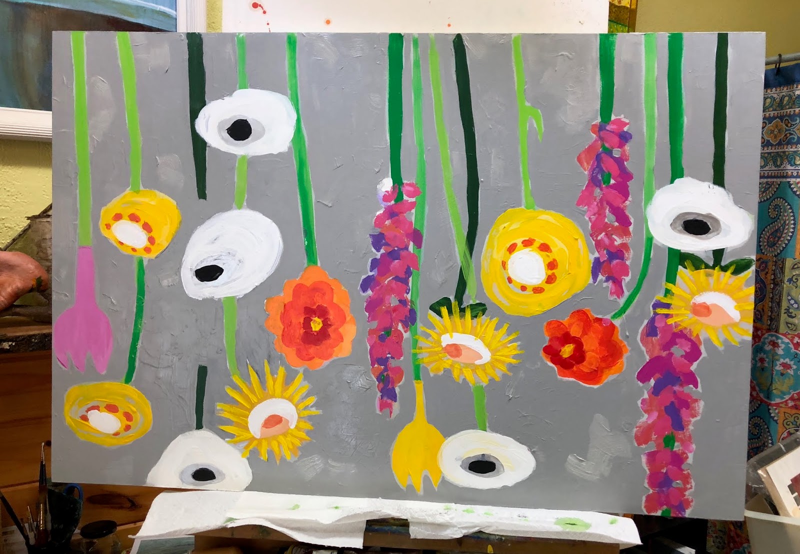
Here is the assignment: create a bright, whimsical floral piece to close the gap between the lights above this "work in progress" bedroom.  

Here is the answer:


"Field of Dreams" acrylic, 24 x 36

I think it is asking for a broad gray/white frame or to be mounted on a larger white board?

It will accomplish the task of brightening and cheering up the space.  But easy? Oh my no.  First off I got way too many flowers on the piece and it was a jumbled mess.  As I culled the bunch I discovered I was leaving texture on the board that was not repeated elsewhere.


So of course I start adding some "fake" texture to even it all out.  Then I painted a silver fence in trying to give it more...more I don't know what.  So that had to come out.  And just as I was ready to cry 'uncle' I noticed that my stems and flowers now did not match up.  Just the thing to keep one busy while it rains outside.


I even worked on it upside down to figure out where all this was going to go.


close up

But all is said and done and I am ready to hang it.  No, whimsy is not really my playground but every now and again I have to stick my whole self in just so I remember that nothing is as easy as it looks.

Off to the framers.

WHIMSICALLY YOURS,
Cindy

Wednesday, August 23, 2017

Eclipse - Part I

I've been thinking a lot lately about how art reflects
the times in which it was created.  It often documents
historical events or records emotional
reactions to the news of the day.  That seems to be the work
that survives the test of time.


To that end I felt it necessary that I make a mark related to the recent eclipse.  Yes, I had eclipse-mania and really looked forward to enjoying the phenomenon.  We were not in the zone of totality but good enough to make it an "event."  It was wonderful, I enjoyed it on so many levels and tried to soak it up through all my senses hoping to be inspired towards paint.


No one, no one had a better picnic than we did!  We even had a playlist of moon and sun related music!  I decided that the least I could do regarding a painting of the event was to try.  So I began to make some sketches in my book of possible designs for an abstract layout.


This was merely a brainstorming style exercise as I was going to use color, collage, markers...whatever it took to convey some feeling about the event.  And I had to question myself carefully to articulate what those feelings were.  Gosh...more difficult than just throwing some paint around.

paper

I chose several supports in various sizes, and got started.  I knew I needed a "hill" (we were on the top of a friend's mountain) and I knew I needed a wonderful blue sky with all shapes of lovely clouds.

canvas

I wanted a lot of layers and a variety of media...a very hard assignment for someone who gets impatient to see the final result waaaaay before it is ready to present.

wood panel

This is definitely a "push/pull" exercise as I put things down and then I cover them up.  The bad news is that if I fall in love with a part, it eventually gets covered; the good news is that when I make a mistake, I just cover it up.

I'm not happy with the sun and the moon....they feel too heavy.  Or perhaps the colors need repeating elsewhere.  But as today's sun was setting and I was still engrossed in my studio, I decided that these would be finished another day.  It's always a surprise to return and see what transpired....after a good nights sleep work always looks different.

So hang on...I will finish and post. Who knows where they will go or if I will ever share them beyond this post. I wanted to try....thats what it is all about.

And I'm curious, have you felt a need to document your eclipse experience in some way?  Please share....

DIGGING DEEP,
Cindy

Friday, March 17, 2017

Inspiring Colors of Marrakech

...Colored cottons hang in air
charming cobras in the square
Striped djellabas we can wear....
They're taking me to Marrakech, all aboard.

(Graham Nash, - Crosby, Stills & Nash  1969)


Jardín Majorelle, Yves Saint Laurent Studio

As I sang my heart out with C, S & N, lo those many years ago,  I had no idea I would actually get to experience the sights that inspired those words.  Oh my....so as I sift through the sensual treats of two weeks of painting in Marrakech I will simply share here a bit of the inspiring color.


street music and intimate concerts


color at every turn


ornate craftsmanship on products used for centuries


 crowded alleys and busy streets in the medina led
to the legendary souks


and contrasted with the serene 

So hold that thought!  I feel some stories emerging and some paintings waiting to come to life.  A city of contrast, of shadow, of color ... filled with the great warmth of its citizens, Marrakech was a treat in all respects.  More to come.


Brimming with Color,
Cindy


Friday, August 12, 2016

Deep Woods

“A painting requires a little mystery, some vagueness, 
and some fantasy. When you always make your meaning perfectly plain 
you end up boring people” 
― Edgar Degas

When I was first learning to paint from photographs I had a wonderful teacher who would let me go just so far and then insist I get rid of the photo.  This can make a student very nervous but is an excellent way to learn how to make "art" as opposed to making a copy.  I couldn't agree with Degas more: a little mystery to the meaning is much more intriguing.

I love to hike altho I often prefer to meander...my hiking friends move along so fast that I often miss the thrill of the wander.  When I head out by myself I see things that are never captured in a photo and the best result is what I feel.  The breeze, the smells, the sounds...they make one feel something that is hard to paint.  How to capture that for a viewer?  I keep trying.


"Deep Woods" oil, 30 x 30
framed
Crossnore Gallery of Fine Art


If you have ever settled down on a rock, alone, deep in the woods and gazed at the wonders before you then you know this scene well.  Sometimes joy is calming and subdued, somethings it is a riot of color and crazy smells.  On certain days it is all of the above ...and more.


detail of  "Deep Woods"


Hope your day is color full,
Cindy

Friday, November 13, 2015

No Longer in the Fast Lane

One of the pleasures - and problems- of being an artist is that you often see things that would make great paintings and then they are gone.  Either they no longer exist or you never return to that locale.
Most often it is an inability to slow down and take notes or photos or even just memorize the scene for later work.

Such was the case when I often whizzed by an open field fenced by a line of old trucks.  I was never able to slow in time to pull off and photograph the composition but I would spend the rest of the trip thinking about them and the symbols they brought to mind.  Finally I made an intentional trip out to the field with camera in hand.

Time passed, deadlines came and went, and still the photo did not materialize on a canvas.  Until one cold and dreary day I decided it was time to tackle the scene.  With abandon and a palate full of color I began:


Sometimes I cant wait to see what will emerge so I start off in acrylics...they dry rapidly and a playful attitude really emerges when I know that I will be painting on top of it all over again.


At various times I thought of these trucks as retired men getting together, sharing their experiences or bragging about the good old days.  At other times I saw them as objects of desire, now past their prime and cast aside.  Maybe they were even jewels in the rough catching the sun and showing their colors now hidden by rust.

I tend to get metaphoric when I abandon all rules of realistic tonal qualities and perspective.  To paraphrase Cyndi Lauper: a  girl just wants to have fun (now and then).  So I did.


ROMEOs 12 x 36, oil
(Retired Old Men Eating Out) Available

Creatively Color Full,
Cindy

Friday, July 17, 2015

Painting a Personality

I have complained, and whined and worried over the fact that I seem to bounce around a lot in the methods I employ while painting.  "I have no style," I moan to mentors or anyone who will listen.  "No one can ever tell if a painting is mine, I am not consistent."

After a few years of just accepting that fact and riding the train where ever it took me, I suddenly realized that there are some repetitive traits about my work, there is a fingerprint if you will, to what I do.

Fer instance.....I just finished this (for me) gigantic (24" x 48") piece:


I Lift Up My Eyes
oil on gallery wrap canvas, 24 x 48

I tend to drag these pieces around the house as I approach finish so I can judge them in different lights.  My husband saw it and did a "hmmm."  "Hmmm: what?" I asked, "is something wrong?"  "It's just so dark," he explained, "so, so bold."  I 'hmmed' him back and sat down to think about it.  Yes, it is dark, and bingo: bold.  But that is the way I saw this yummy long view of the mountains.  Gentle hills with bold color statements.  

I wandered back in memory to the first adult art lesson I had: the proverbial apple still life.  I finished and the teacher gave it a serious look.  "Have you always been this bold and colorful?" she asked.  I explained that I had not painted in many years.  "No, I mean in life," she clarified, "your personality."

"A Ha"....an ah ha moment...no, I do not think of myself as bold but I do admit to loving color.  Maybe, that's my style?!  More pondering is needed, however...

...think about this story when you next view a body of work by one artist.  WHAT is consistent among the pieces?  What trait or line or technique or.... is repeatedly seen, however obscured, in each thing she or he produces.  Maybe that is the "style", or at least a clue to the personality, of the artist. Styles morph and develop (as do personalities) but hidden on the canvas, or in the clay or on the fabric, is a clue to the creator, how he or she views the world, what they pick out as important, what they emphasize or downplay.  

I guess I have to own it: no soft gentle florals for me, no wispy pastels fading in and out of view, every time I try to emulate that gorgeous misty technique I end up with a dash of hot pink or a streak of violet ruining the effect.  Its inauthentic for me.  I buy it, I hang it, but I cannot paint it.  

So play psychologist the next time you enter an artists' booth.  Ask yourself what they deem important, how do they consistently use a particular technique to portray it and what does that tell you about the rest of the person and their demeanor.  It's just one more way to enjoy art.

Boldly Yours,
Cindy


Saturday, March 8, 2014

The Colors of San Miguel

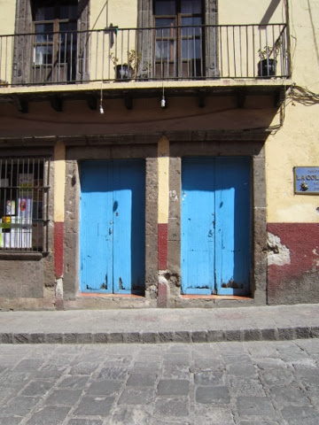
Color is everywhere the doors of San Miguel
                                            The pottery of San Miguel
                                               the fabric and cloth of San Miguel
Even splashes of vibrant yellow along the roadways           

                                                                   outside San Miguel

You do not have to look far for color inspiration in San Miguel...it is everywhere and contrasts loudly with the now-brown countryside.  When the spring rains begin the place will come alive with flowers and verdant green fields.  But for now I love finding the colors jumping out at me and screaming for attention against the earthy colored background.

And speaking of attention: gold stars to those of you who caught my (mindless) error in the last blog: blue, of course, is a primary color and when mixed with yellow, another primary, it makes green.  Apparently I left a bit of my brain at the health department!  Big kudos to those of you who noted the reversal and nodded in understanding for the foggy confusion I was still in!  I will do better, I will never be error free, but better!

We had a play date today. Instead of hitching a ride with fellow farm guests we took the rickety bus into town - a 50 minute bouncey ride that only takes about 15-20 minutes via auto.  I confess that I love public transportation; what better way to get a real flavor, not to mention smell, of the local populous as well as the scenery?  It was Saturday and lots of folks had time to go into town...I so enjoyed myself that they literally had to kick me off the vehicle at the end of the line!

From there we were on a walking mission to find a Rotary member Bob had connected with and to locate a door knocker for our front door.  The buildings of San Miquel come right up to the edge of the cobblestone streets leaving only about a 24" sidewalk, also of raised cobblestones and very uneven, for pedtrestrians to walk on.  The magic of the city is behind the doors which open onto the streets.  There is no way to imagine what might be contained therein....a tiny shop or the most elegant entrance to a home or hotel.  Large patio gardens sometimes precede a restaurant whose name is discreetly on the door, or it might open onto a hallway for apartments.  No clue!
                                       

So I will go to sleep tonight imagining my door photos made into precious little paintings....I just have to decide whether to execute in watercolor or acrylic....or both!

Sending you colorful dreams,
Cindy


Friday, July 26, 2013

Color is Black and White....

Remember when our technological world made everything black and white?  Our television shows were in black and white as were our photos.  I don't remember complaining about it, our minds seemed to do an adequate job of filling in the detail.

In contrast today everything is in color, living color, splashing color, neon color and colors never in even the largest Crayola box.  I love color.  Color seduces us, soothes us and excites us.  Perhaps we are drawn to make art simply because the playground is so bright and wonderful.

However, it is easy to let color run away with the story and this fact was brought home so clearly at a recent workshop I took with colorist Andy Braitman.  Take a look at his art and you will swoon for the color combinations.  He can actually made a 2D canvas vibrate with the scene at hand.  Yet Andy spent three days discussing the importance of VALUE.  To make it simple let's imagine that every color in the universe falls into one of three categories: dark, medium and light.  In other words, apply a black and white camera to something you are looking at and the values, not the colors, will be obvious.  This is a relatively simple idea to grasp but one that takes many hours to understand in the world of painting.

Unless you are an artist you really don't want me to explain much more about this concept.  But I bring it up because it is an excellent concept to apply when you are viewing art.  If something doesn't "feel" right to you it is probably because the execution did not give close attention to the role of value.  Yes, you like the use of red and blue but are all the reds the same, do any of the blues move to the background while some come forward?  You can ask these questions without really having to know the whys.  Your gut will tell you if it all hangs together in a pleasing way or is a bunch of unrelated shapes.  Squint your eyes until all you see are black and white (or greyish) shapes...are they still pleasing or disconcerting? 

You're well on your way to critiquing art!

Here's a piece I did under his guidance:
 
 
And here it is in black and white:
 
 
One last test, let me know specifically where your eye travels, or lingers and I'll let you know if I did it correctly!
 
 
Color Fully Yours,

Cindy


Saturday, June 22, 2013

Caught!

You caught me!  This blog is late by about 24 hours and there is a very good reason why: I'm having a little too much summer fun.  My painting has mostly been on my saint series so my out-of-the-studio activities have ranged from jaunts to NYC and DC to mountain hiking.  I've been making colorful little pot holders, mosaic stepping stones, and lamps (yes, wiring lamps!). So I'm like a kid out of school and have no profound tidbits from the art world to pass along.....

However......
I did want to share this cute reminder of what summer is all about.  I was foraging in a friend's studio recently and she had this laying on her desk ready to color in and fill out:
(click HERE to see how to get your own copy, its from pen & paint blog
my thanks to Cheri at artsymatilda)

It reminded me that if I don't write down a few of the fun goals I had for the summer (rent a canoe on Price Lake, swim in Elk River, hike part of the mtn to sea trail...) they wouldn't get done.
So I am sharing this with you in case you need to color in your own summer bucket list and get started checking them off.  After all, school is out and it is time to kick back and play a little...or a lot!

Cindy