Join me....

I believe that art enriches and informs our lives everyday in many positive ways. Sharing those experiences, whether as an artist or as an appreciator, is part of the pleasure. I welcome your comments and hope you find something of value: a laugh, an insight, a new idea or just a happy moment. Enjoy art!
Showing posts with label limited palate. Show all posts

Friday, January 19, 2018

Painting with Artistic License

It took me years to realize that permission
to change things was granted when
I picked up my "artistic license."

I love to look back on my own process and see where certain decisions got made about the direction of a work.  Somethings can be changed as the closing marks are laid down but some decisions get made right up front.


photo of a parkway overlook, cropped by folding

I liked the shadows in this photo made by the light coming through the trees.  But I made some executive decisions when I laid out the piece in a black/white/grey underpainting.


Already you can tell that I wanted more sky and background and that the brightest lights would be in the sky, the edge of the largest tree and then to the road.  I liked this layout and really thought it worked fine as executed.  The bits of orange I was trying to leave were from a painting underneath.  As I choose my final color palate however I decided not to leave them.  (Perhaps I should have stopped right here?)


I did ok  keeping my middle tones together and laying out where I thought I wanted the lightest lights to go.  


Then I lost all organization and decided to abandon the piece for a bit.   I had lost most of the original lights and the darks were mostly a blackish brown which was not very interesting.  I began to lose interest when I realized I had not kept the light areas connected as they originally were.

NOT looking at a piece for a while can be as helpful as taking the time to look closely.  I would occasionally set it back up on the easel and play around a bit never really being totally satisfied.  Keep in mind that the reason it has blue tape around it is because I was painting it in the frame.  Yes! Not something I suggest you try at home but I was experimenting on top of an old piece that I could not remove from the frame so what the heck...the fact alone made me willing to take some chances.


finished?  for now.

So I'm done.  I think.  It changed a lot and I still believe the foreground could use some simplification.  But nothing ventured, nothing gained.  I used my "license" not only for permission to change the reference photo but for using up the surface of another painting.  I don't think I made a silk purse out of a sow's ear but I do want to use this reference again in a different palate - I believe my rehearsal was well worth the time.  I may even take a white marker and redesign bits of it just for future use.  And, while you cannot see it here, painting on top of another piece made for a very interesting texture.  Onward....

Using My License to Practice (art),
Cindy


Friday, October 6, 2017

Limited Palate Painting

While color intrigues me, I am learning that
unless you have control of the color it can
totally overwhelm a painting.  I have been trying
 to learn how to limit my palate and become intimately
familiar with how color mixes.


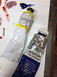
For this limited palate experiment I selected 3 analogous colors (next to each other on the color wheel) and the complimentary color to the center one (in this case, the purple).  Add to this the ingredients for mixing black (burnt siena and french ultramarine) and a white, and I have all of the tubes I would use for the entire painting.  No, this was not my comfort-zone palate.  Game on.


I laid out the colors and began to imagine what I could mix up from different quantities of each.  Once a lovely color is found you can lighten it and get several tones from it.  This part is really fun.
The hard part is reproducing in a large amount something that suddenly works in a small bit.


My subject, the entrance view to the Santa Elena Canyon, was already laid out on my 24" x 24" canvas in the three tones of black and white.


done with a black charcoal, medium and white oil

Now I went in with large swatches of color mixed from the limited palate and staying carefully within the tones I had established with the charcoal and white above.


you might be able to see some texture I laid down in this first pass:
I used a roller, made scribbles with a rubber tip and drew lines with my palate knife


I kept mixing and began to add some dimension to the grassy bank, put a little more interest 
in the front bank and tried to get a handle on how the rocks would jut in and out.

I like working on dry layers (this helps preserve the texture which will eventually show up better) so by necessity I worked slowly and methodically.  I would eat my lunch talking to the piece trying to determine what would be tweaked on the next round, the next day. Again, I had to use only the few tubes of paint I had laid out.

Here's the final...maybe.


24" x 24" oil
Santa Elena, incomplete

I'm not so pleased with the mound of the upper left rock....which was going to be my focal point.  I need to redefine it in some way that is believable (the top edge really softens near the sky) but still remains an eye grab (lightest light next to the darkest dark).  But otherwise I think the piece hangs together nicely.  Perhaps some of that lighter gold up there will help?  See?  The problem solving is actually fun when you have limited tools at your disposal.  

Right now I have a totally different piece underway with the exact same palate.  Stay tuned to see how different it is in coloration.  

LIMITING COLORS...for now,
Cindy

Friday, July 21, 2017

Tobacco Barns & Days Gone By

Sometimes I give myself a painting assignment
just to up the ante in my process.  This time
I chose to paint in two layers: the first
would be rendered in yellow, red and white; in the
second I could only use yellow, blue and white.

Tobacco barns are a familiar sight in the western North Carolina area.  No longer used for their intended purpose, many of them stand empty and sad, slowly disintegrating before our eyes.  The evils of tobacco notwithstanding, I have an affinity for these old structures and often pause wishing I could know the tales they hold in their old weathered boards.  Now and again I am able to get a decent photo...too many are located on fast moving roadways that preclude pulling off to explore.  But when I do get a pic, I have fun painting them in a variety of ways.


Limiting myself to a strict palate of only what I could mix with yellow, red (primary colors) and white if needed, I made my first pass at the scene with an acrylic underpainting.


I actually liked the feel this gave and left it for a few days as tribute to the warm and humid days when the tobacco hung.  I was also contemplating what I might do with my next selected colors.


So I switched to oil paints and put away the red adding the third primary blue.  Now I could mix these two for green and/or put glazes of blue on top of red for purples or on oranges for...so I got to work.


I was tentative in the sky because I really liked the yellow overcast but worked on clouds while deciding just how blue to go.  I also wanted the attention to flow up the hill and thru the barn so did not want to provide too much distraction in the orangish foreground.  Restraint was called for even with so few colors to work with.  I had to rely on brush stroke, temperature and perspective to get my message across.  


My Father's World
oil, 24 x 24, on cradled board, $325

And even though my father's farm did not grown tobacco, this was of his era so the name felt appropriate.  I would give anything for an afternoon of stories from this barn, and even more so, from my Dad.  Meanwhile, the structure sits alone, a beacon of days (and economies) gone by.

PRIMARY COLORS,
Cindy